Radar chart Tips and tricks, and shortcuts

Tips and Tricks for Line Chart In Data Interpretation

Definition of Radar Chart

Go through the entire page to know Radar chart Tips and tricks and shortcuts.

Radar charts (also known as spider charts, polar charts, web charts, or star plots) are a way to visualize multivariate data. It is a graphical method of displaying multivariate data in the form of a two-dimensional chart of three or more quantitative variables represented on axes starting from the same point. They do this by giving an axis for each variable, and these axes are arranged radially around a central point and spaced equally.

The data from a single observation are plotted along each axis and connected to form a polygon. Multiple observations can be placed in a single chart by displaying multiple polygons, overlaying them and reducing the opacity of each polygon.

Tips, Tricks and Shortcuts to solve Radar Chart

  • Try not to represent more than 15 variables in a single chart else it can clutter the diagram.
  • Have all the axes equally distributed unless stated otherwise
  • If it is a comparative chart, then try not to go overboard and keep things simpler.
  • Try to have a common and feasible scale to measure all variables.
  • You can have different color codes to distinguish the entities on the same scale.

Important Notes on Rader Chart

  • In Radar chart, every value is represented with respect to a central point.
  • All the changes in the values are expressed in the form of distance from the central point.
  • Radar chart is not used for identifying the accuracy in data, but rather generalized relationships between data.

Radar chart Tips and tricks and shortcuts in DI

Refer to the Radar chart given below and answer the questions  1-3:
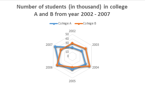
The given Radar chart shows the Number of students(in thousand) in college A and B from year 2002 – 2007.
Assumption: Total number of students in each college is given in terms of thousand.
Rader chart Tips and tricks, and shortcuts_1

Question 1.

 Which year has the highest number of difference between the number of students in college A and college B?

(a) 2002
 
(b) 2004
 
(c) 2006
 
(d) 2007
 
Answer: Option D
 
Explanation :

In 2002 the difference was: 30 – 20 = 10

In 2003: 35 – 25 = 10

In 2004: 45 – 35 = 10

In 2005: 30 – 25 = 5

In 2006: 40 – 35 = 5

In 2007: 45 – 30 = 15

Therefore, the difference was highest in the year 2007.


Question 2.

 Find the sum of the students in college A in 2002 and college B in 2006?

(a) 25000
 
(b) 50000
 
(c) 60000
 
(d) 63000
 
Answer: Option C
 
Explanation :

Students in college A in 2002 = 20000

Students in college B in 2006 = 40000

Therefore, sum = 20000 + 40000 = 60000 students.

Question 3.

 Find the percent increase in college A’s students in the year 2006 as compared to the previous year.

(a) 16.66%
 
(b) 17%
 
(c) 21%
 
(d) 25%
 
Answer: Option A
 
Explanation :

In the year 2005, the students in college A were: 30

In the year 2006, the students in college A were: 35

Therefore increase = 35 – 30 =5

Thus, percent increase = 5/30 * 100 = 16.66%

Direction for questions  4-5:

The given Radar chart shows the sale of mobile phones and tabs of a company from 2011-2016(in thousand).
Assumption: Total sale of mobile phones and tabs are given in terms of thousand.
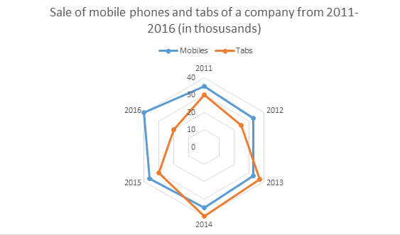
Rader chart_2

Question 4.

 What is the proportion of total number of tabs sold to the total number of mobile phones sold in all the years?

(a) 45 : 118
 
(b) 108 : 166
 
(c) 91 : 106
 
(d) 60 : 159
 
Answer: Option C
 
Explanation :

Total number of tabs sold from 2011 to 2016 = 30 + 25 + 37 + 40 + 30 + 20 = 182
Total number of mobile phones sold from 2011 to 2016 = 35 + 33 + 33 + 35 + 36 + 40 = 212
Therefore, ratio = 182/212 = 91:106


Question 5.

 In which year there was maximum percentage upsurge in the sales for tabs?

(a) 2013
 
(b) 2014
 
(c) 2015
 
(d) 2016
 
Answer: Option A
 
Explanation :

For tabs the sale in 2011 was 30 and in 2012 was 25. Therefore, the sale decreased. In 2012 was 25 and 2013 was also 37. Therefore, there was increase by 12 thousand. Percent increase = 12/25 * 100 = 14%. In 2013 was 37 and 2014 was 40. Therefore, there was an increase by 3 thousand. Percent increase = 3/37 * 100 = 8.10%. In 2014 was 40 and 2015 was 30. So, the sale decreased. In 2015 was 30 and 2016 was 20. Therefore, the sale decreased

Thus, highest increase in the sale was in year 2013.

Prime Course Trailer

Related Banners

Get PrepInsta Prime & get Access to all 200+ courses offered by PrepInsta in One Subscription

Get over 200+ course One Subscription

Courses like AI/ML, Cloud Computing, Ethical Hacking, C, C++, Java, Python, DSA (All Languages), Competitive Coding (All Languages), TCS, Infosys, Wipro, Amazon, DBMS, SQL and others

Checkout list of all the video courses in PrepInsta Prime Subscription

Checkout list of all the video courses in PrepInsta Prime Subscription