
 Apply For Jobs
 Get Hiring Updates
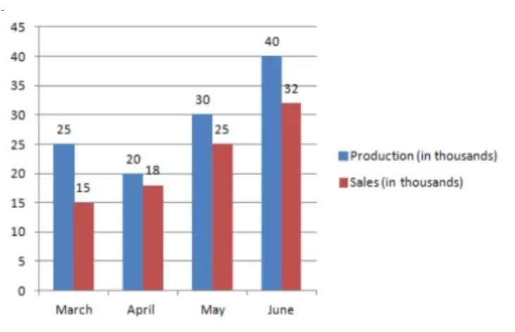
Bar Chart Questions and Answers


×


Get Hiring Updates right in your inbox from PrepInsta
Login/Signup to comment