PREPINSTA PRIME
Radar chart Tips and tricks, and shortcuts
Tips and Tricks for Radar charts
Go through the entire page to know Radar chart Tips and tricks and shortcuts.
Radar charts (also known as spider charts, polar charts, web charts, or star plots) are a way to visualize multivariate data. It is a graphical method of displaying multivariate data in the form of a two-dimensional chart of three or more quantitative variables represented on axes starting from the same point.
They do this by giving an axis for each variable, and these axes are arranged radially around a central point and spaced equally.

Tips, Tricks and Shortcuts to solve Radar Chart
- Try not to represent more than 15 variables in a single chart else it can clutter the diagram.
- Have all the axes equally distributed unless stated otherwise
- If it is a comparative chart, then try not to go overboard and keep things simpler.
- Try to have a common and feasible scale to measure all variables.
- You can have different color codes to distinguish the entities on the same scale.
Important Notes on Rader Chart
- In Radar chart, every value is represented with respect to a central point.
- All the changes in the values are expressed in the form of distance from the central point.
- Radar chart is not used for identifying the accuracy in data, but rather generalized relationships between data.
Elements of Radar Chart
| Elements | Uses |
|---|---|
| Center Point | Center of the radar chart from which axis for different subjects protrude out. |
| Axis | Center of the radar chart from which axis for different subjects protrude out. |
| Values | Values are represented on each axis with different colors. |
| Grids | When values of a particular case are linked in all the axis it forms a web like structure which helps in representing information. |
Important points for Radar Charts
Axes: A radar chart consists of a set of radiating axes or spokes that extend outward from a central point. Each axis represents a different variable or category. The number of axes depends on the number of variables you want to compare. For example, if you are comparing five attributes, you would have five axes evenly spaced around the central point.
Data Points: Data points are plotted along each axis at a distance from the central point, representing the values of the variables for a particular data point. These data points are connected by lines to create a closed shape, often resembling a polygon or a web. The shape formed by the lines provides a visual representation of how the data point performs across the different variables.
Data Interpretation: Radar charts provide a visual means to assess how a data point’s values compare across different variables. Users can quickly identify strengths and weaknesses in the performance or attributes of the entities being analyzed. The area enclosed by the lines connecting the data points can also be used to make comparisons; a larger area typically indicates better overall performance.
Prime Course Trailer
Related Banners
Get PrepInsta Prime & get Access to all 200+ courses offered by PrepInsta in One Subscription
Radar chart Tips and tricks and shortcuts in DI
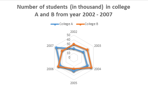
Refer to the Radar chart given below and answer the questions 1-3:

Question 1.
Which year has the highest number of difference between the number of students in college A and college B?
In 2002 the difference was: 30 – 20 = 10
In 2003: 35 – 25 = 10
In 2004: 45 – 35 = 10
In 2005: 30 – 25 = 5
In 2006: 40 – 35 = 5
In 2007: 45 – 30 = 15
Therefore, the difference was highest in the year 2007.
Question 2.
Find the sum of the students in college A in 2002 and college B in 2006?
Students in college A in 2002 = 20000
Students in college B in 2006 = 40000
Therefore, sum = 20000 + 40000 = 60000 students.
Question 3.
Find the percent increase in college A’s students in the year 2006 as compared to the previous year.
In the year 2005, the students in college A were: 30
In the year 2006, the students in college A were: 35
Therefore increase = 35 – 30 =5
Thus, percent increase = 5/30 * 100 = 16.66%
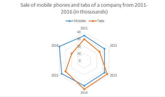
Direction for questions 4-5:
Assumption: Total sale of mobile phones and tabs are given in terms of thousand.

Question 4.
What is the proportion of total number of tabs sold to the total number of mobile phones sold in all the years?
Total number of tabs sold from 2011 to 2016 = 30 + 25 + 37 + 40 + 30 + 20 = 182
Total number of mobile phones sold from 2011 to 2016 = 35 + 33 + 33 + 35 + 36 + 40 = 212
Therefore, ratio = 182/212 = 91:106
Question 5.
In which year there was maximum percentage upsurge in the sales for tabs?
For tabs the sale in 2011 was 30 and in 2012 was 25. Therefore, the sale decreased. In 2012 was 25 and 2013 was also 37. Therefore, there was increase by 12 thousand. Percent increase = 12/25 * 100 = 14%. In 2013 was 37 and 2014 was 40. Therefore, there was an increase by 3 thousand. Percent increase = 3/37 * 100 = 8.10%. In 2014 was 40 and 2015 was 30. So, the sale decreased. In 2015 was 30 and 2016 was 20. Therefore, the sale decreased
Thus, highest increase in the sale was in year 2013.
Get over 200+ course One Subscription
Courses like AI/ML, Cloud Computing, Ethical Hacking, C, C++, Java, Python, DSA (All Languages), Competitive Coding (All Languages), TCS, Infosys, Wipro, Amazon, DBMS, SQL and others

Series
- Line Charts – Questions Formulas | How to Solve Quickly | Tricks & Shortcuts
- Pie Charts – Questions | Formulas | How to Solve Quickly | Tricks & Shortcuts
- Bar Charts – Questions | Formulas | How to Solve Quickly | Tricks & Shortcuts
- Radar Charts – Questions | Formulas | How to Solve Quickly | Tricks & Shortcuts

Series
- Line Charts – Questions
Formulas |
How to Solve Quickly |
Tricks & Shortcuts - Pie Charts – Questions |
Formulas |
How to Solve Quickly |
Tricks & Shortcuts - Bar Charts – Questions |
Formulas |
How to Solve Quickly |
Tricks & Shortcuts - Radar Charts – Questions |
Formulas |
How to Solve Quickly |
Tricks & Shortcuts

 Apply For Jobs
 Get Hiring Updates


