Introduction to Tableau Interface and Navigation for Beginners
Introduction to Tableau Interface
Introduction to Tableau interface and navigation is the first step in mastering data visualization in data analytics. Tableau is widely used for analyzing data and building interactive dashboards, but before creating visualizations, it is important to understand how its interface works and how to navigate efficiently. A clear understanding of the Tableau workspace helps beginners work faster, avoid confusion, and build better dashboards.
What is Tableau?
Tableau is a powerful data visualization and business intelligence tool that allows users to:
- Connect to multiple data sources
- Analyze and explore data
- Create interactive charts and dashboards
- Share insights with teams
It is widely used by data analysts, business analysts, and organizations for data driven decision making.
Overview of Tableau Interface
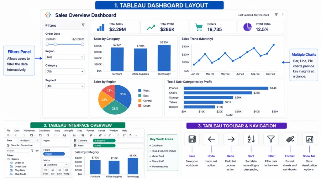
Main Components of Tableau Interface
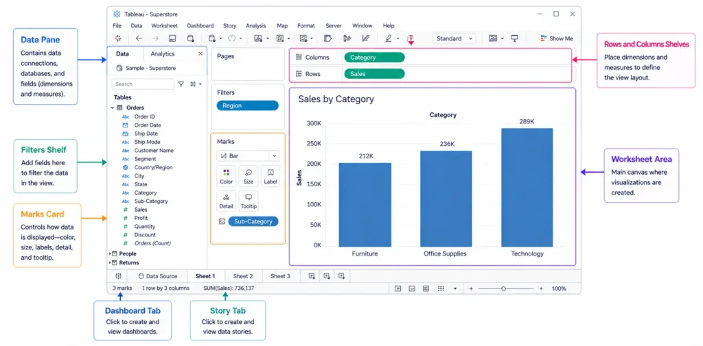
1. Data Pane:
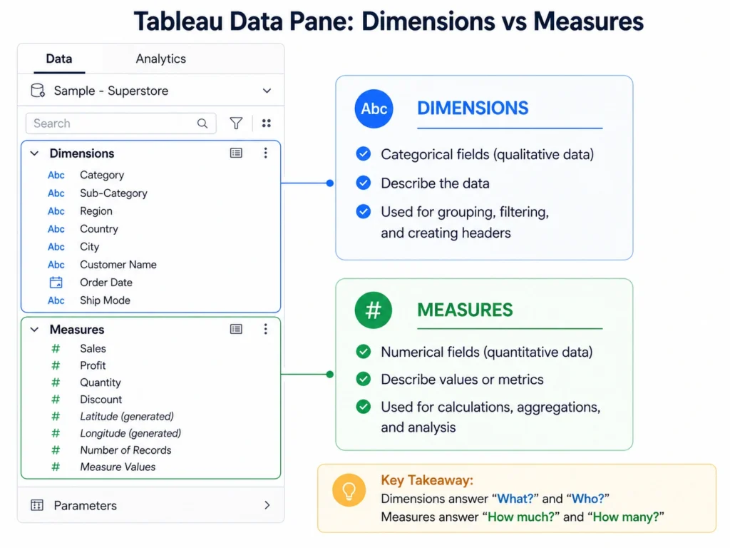
The Data Pane is located on the left side of the screen and contains all the data fields.
It is divided into:
- Dimensions → Categorical data (Ex. Region, Category)
- Measures → Numerical data (Ex. Sales, Profit)
This is where you select fields to build visualizations.
2. Worksheet Area (Canvas)
The worksheet area is the main workspace where visualizations are created.
You can:
- Drag fields into rows and columns
- Build charts and graphs
- Analyze data visually
3. Rows and Columns Shelves
These shelves define how your data is displayed:
- Rows Shelf → Controls vertical layout
- Columns Shelf → Controls horizontal layout
Placing fields here determines the structure of your visualization.
4. Marks Card
The Marks Card is used to customize the appearance of your visualization.
It includes:
- Color and Size
- Label and Detail
- Tooltip
This helps improve the readability and presentation of charts.
5. Filters Shelf
Filters allow you to refine your data by selecting specific values.
Example:
- Show data for a specific region
- Filter by date or category
6. Dashboard and Story Tabs
At the bottom of Tableau:
- Dashboard → Combine multiple visualizations
- Story → Create a sequence of insights
These features are used to present data effectively.
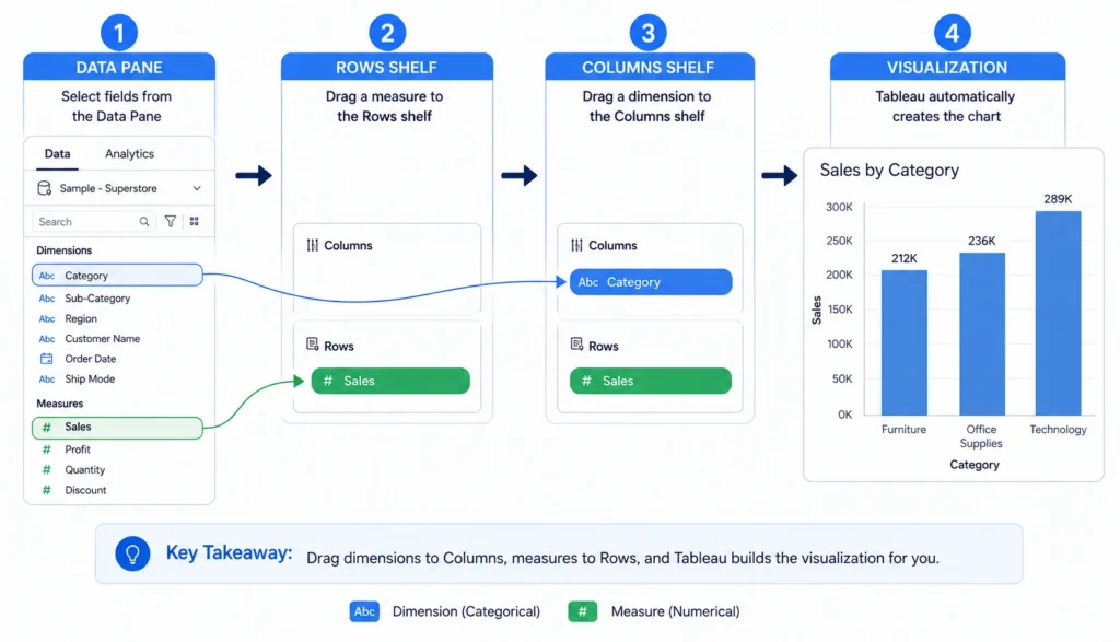
How to Navigate in Tableau
2. Drag them to Rows or Columns
3. Choose chart type
4. Customize using Marks Card
5. Apply filters if needed
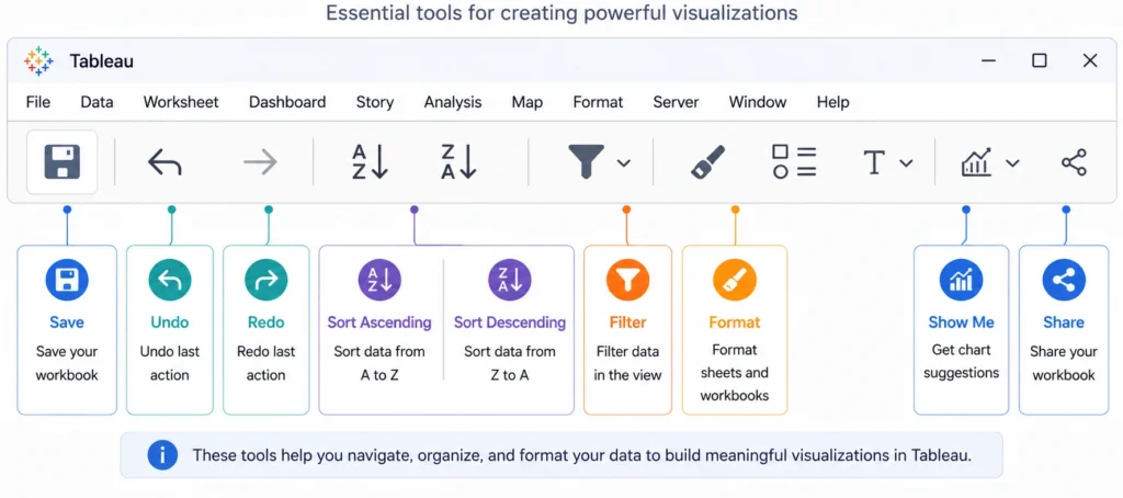
Understanding Tableau Toolbar
2. Undo / Redo
3. Sort
4. Filter
5. Format
It helps in improving efficiency while working.
Tableau Dashboard Layout
1. Presenting insights clearly
2. Comparing multiple charts
3. Adding interactivity with filters
Basic Workflow in Tableau
2. Explore data in Data Pane
3. Create visualizations
4. Apply filters and formatting
5. Build dashboards
Understanding this workflow is essential for working efficiently in Tableau.
Common Mistakes Beginners Make
- Not understanding dimensions vs measures
- Overcomplicating dashboards
- Ignoring filters and interactivity
- Not organizing worksheets properly
- Poor navigation habits
Avoiding these mistakes helps in learning Tableau faster.
Real World Use Case of Tableau:
A data analyst uses Tableau to:
- Connect sales data
- Create charts for revenue trends
- Build dashboards for reporting
This helps businesses make better decisions based on visual insights.
So the final verdict is that…..
Understanding the Tableau interface and navigation is essential for anyone starting with data visualization.
- By learning how different components like the Data Pane, shelves, and Marks Card work together, you can efficiently create meaningful visualizations and dashboards.
- Mastering navigation improves productivity and helps in building better data driven insights, making Tableau a key tool in modern data analytics.
Frequently Asked Questions
Answer:
The Tableau interface is the workspace where users connect data, create visualizations, and build dashboards.
Answer:
The main components include Data Pane, Worksheet Area, Rows and Columns shelves, Marks Card, Filters, and Dashboard tabs.
Answer:
Navigation in Tableau is done using drag and drop features, filters, and toolbar options.
Answer:
The Data Pane contains dimensions and measures used to build visualizations.
Answer:
The Marks Card is used to customize visual elements such as color, size, and labels.