
Data Storytelling in Data Analytics
How to Explain Insights Clearly
Data storytelling in data analytics is the skill of explaining data insights clearly so that business teams can understand them and take action. A data analyst’s job does not end after cleaning data, creating dashboards, or finding trends. The real value comes when the analyst can explain what the data means, why it matters, and what should be done next.
Without storytelling, even a good dashboard may confuse users. With good storytelling, complex numbers become clear business insights.

What is Data Storytelling?
Data storytelling is the process of using data, charts, context, and explanation to communicate insights in a meaningful way.
It helps answer questions like:
- What happened?
- Why did it happen?
- Why should the business care?
- What action should be taken?
For example, saying “Sales dropped by 12%” is just a data point.
But saying “Sales dropped by 12% in the North region mainly because repeat customer purchases declined after the discount campaign ended” is a data story.
The second version gives context, reason, and business meaning.
Why Data Storytelling is Important in Data Analytics
Data storytelling is important because business teams do not always need raw numbers. They need clear insights that help them make decisions.
- Makes Data Easier to Understand: Not everyone understands complex dashboards, statistical terms, or raw tables. Data storytelling explains insights in simple and business friendly language.
- Helps Decision Making: A good data story does not only show what happened. It also explains what action should be taken.
- Improves Communication: Data analysts often work with managers, marketers, sales teams, finance teams, and product teams. Storytelling helps them communicate insights clearly to non technical people.
- Adds Business Context: Numbers without context can be misleading. Data storytelling explains the business reason behind the numbers.
- Makes Dashboards More Useful: A dashboard becomes more powerful when it includes clear titles, useful KPIs, relevant charts, and short explanations.
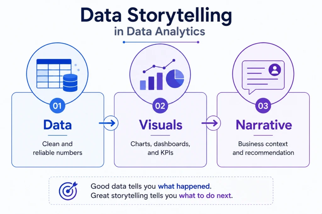
Major Elements of Data Storytelling
1. Data
Data is the foundation of the story. It may come from sales reports, customer data, website analytics, CRM tools, surveys, or business dashboards.
The data must be clean, relevant, and reliable.
2. Visuals
Visuals help users understand patterns quickly. Common visuals include:
- Bar charts
- Line charts
- Pie charts
- Heatmaps
- KPI cards
- Dashboards
The right chart makes the insight easier to understand.
3. Narrative
Narrative means the explanation around the data. It connects numbers with meaning.
A good narrative explains:
- What changed
- Why it changed
- What it means
- What action is needed
The audience is divided into two similar groups. One group sees Version A, and the other sees Version B.
Data Storytelling Process
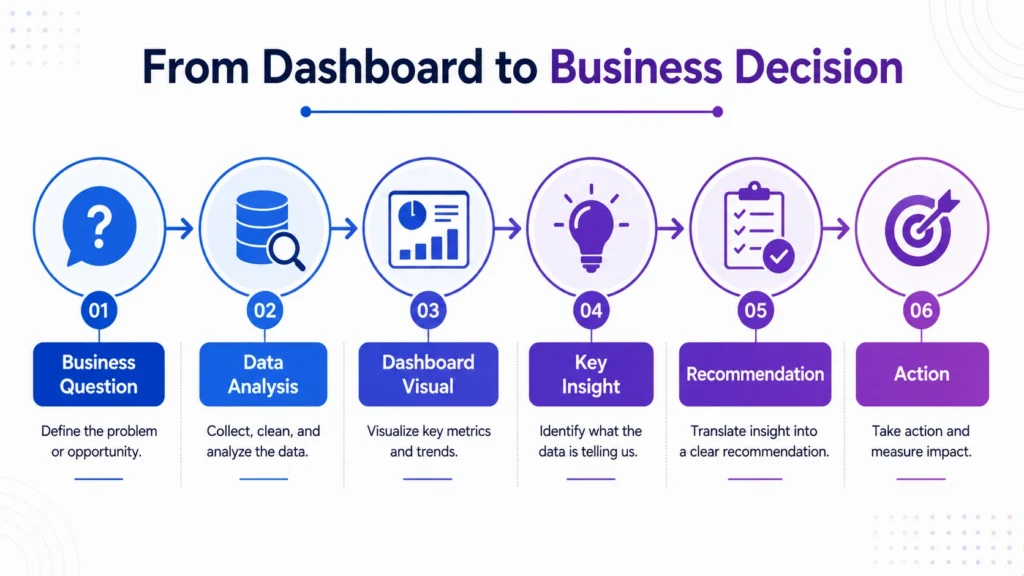
1. Understand the Business Question
Before creating a story, understand the main question.
Examples:
- Why did sales drop?
- Which campaign performed best?
- Which product category is most profitable?
- Why are customers leaving?
- Which region needs attention?
A clear question keeps the analysis focused.
2. Select the Right Data
Use only data that supports the business question. Avoid adding too many unrelated metrics.
For example, if the question is about sales decline, focus on revenue, region, product category, customer segment, discount, and time period.
3. Find the Key Insight
After analysis, identify the most important finding.
Example:
“Revenue declined mainly because repeat purchases dropped in one customer segment.”
This key insight becomes the center of the story.
4. Choose the Right Visual
Choose charts based on the message.
| Insight Type | Suitable Visual |
|---|---|
| Trend over time | Line chart |
| Category comparison | Bar chart |
| Part of total | Pie chart or Donut chart |
| Distribution | Histogram |
| Relationship | Scatter plot |
| KPI tracking | KPI cards |
The visual should support the story, not distract from it.
5. Add Context
Context explains why the insight matters.
Example:
- “Sales dropped by 10%” is incomplete.
- “Sales dropped by 10% after the discount campaign ended” gives business context.
6. Recommend an Action
A strong data story ends with a practical recommendation.
Example:
“Retarget repeat customers with a personalized offer before the next campaign cycle.”
This makes the insight actionable.

Example of Data Storytelling in Data Analytics
Weak Insight….
“Profit decreased in Q3.”
Strong Data Story….
“Profit decreased by 15% in Q3, mainly due to higher discounts in the Electronics category. Although sales volume increased, the discount strategy reduced profit margins. The business should review discount limits and focus on high margin products in the next campaign.”
This is better because it explains:
- What happened
- Where it happened
- Why it happened
- What action can be taken
Data Storytelling vs Data Visualization
Data visualization and data storytelling are connected, but they are not the same.
| Factor | Data Visualization | Data Storytelling |
|---|---|---|
| Focus | Shows data visually | Explains insights clearly |
| Output | Charts and dashboards | Business message and recommendation |
| Purpose | Make data easier to see | Make data easier to act on |
| Example | Sales line chart | Sales declined due to lower repeat purchases |
Visualization shows the pattern. Storytelling explains the meaning.
Common Data Storytelling Techniques
- Start with the Main Insight:
- Do not hide the main point. Begin with the most important finding.
- Example: “Customer churn increased by 8% in the last quarter.”
- Use Simple Language:
Avoid unnecessary technical terms when presenting to business teams.
Instead of saying “negative correlation,” say “as discount increased, profit decreased.”
- Highlight What Changed:
- Business users care about changes.
Show: Increase, Decrease, Trend, Gap, Outlier, Risk and Opportunity
- Use Comparisons:
Comparisons make insights clearer.
Example: “North region sales were 20% lower than South region sales.”
- Connect Insight with Action:
Every useful data story should guide business action.
Example: “Since cart abandonment is highest on mobile, improving mobile checkout should be the next priority.”
Data Storytelling Skills for Data Analysts
A good data analyst needs more than technical skills. They also need communication skills.
Important data storytelling skills include:
- Understanding business problems
- Choosing the right metrics
- Selecting the right charts
- Writing clear insight summaries
- Explaining trends simply
- Presenting recommendations
- Avoiding misleading visuals
- Communicating with non technical teams
This is why storytelling with data is becoming an important career skill for data analysts.
The final conclusion is that….
Data storytelling in data analytics is the skill that turns analysis into action.
- It helps analysts explain insights clearly, add business context, and guide better decisions.
- A strong data story does not only show numbers; it explains what the numbers mean and what should happen next.
For data analysts, storytelling is a career building skill. Tools like Excel, SQL, Python, Tableau, and Power BI help create insights, but communication makes those insights useful. The better you explain data, the more valuable your analysis becomes.
Data storytelling is an important skill for anyone learning analytics because real world data work is not only about tools. Career247’s Data Analytics with GenAI Course covers Excel, SQL, Python, Tableau, dashboards, real world projects, and analytics communication skills that help learners explain insights clearly and become job-ready.

Frequently Asked Questions
Answer:
Data storytelling in data analytics is the process of explaining data insights using data, visuals, context, and recommendations so that business teams can understand and act on them.
Answer:
Data storytelling is important because it helps convert raw data and dashboards into clear business insights and better decisions.
Answer:
The three main parts of data storytelling are data, visuals, and narrative. Together, they help explain what happened, why it matters, and what action should be taken.
Answer:
Data visualization shows data through charts and dashboards, while data storytelling explains the meaning behind those visuals and connects them with business decisions.
Answer:
Important skills include data interpretation, chart selection, business understanding, communication, dashboard design, and the ability to explain insights in simple language.