
CSS Interview Questions and Answers
CSS Interview Questions and Answers
CSS Interview Questions and Answers – Are you preparing for an interview and want to know what CSS-related questions might come your way? This page is designed to help you! Here, you’ll find a well-organized list of commonly asked CSS interview questions in both off-campus and on-campus placements.
To make your preparation smooth and effective, we’ve structured the questions in a logical sequence. Go through each one carefully to ensure you’re fully prepared. So, let’s dive in – stay focused and keep learning! 😊
CSS Interview Questions and Answers Asked
CSS Interview Questions and Answers Asked
CSS (Cascading Style Sheets) is a styling language used to control the appearance and layout of HTML elements on a web page. It allows developers to separate content (HTML) from presentation (CSS), making web pages visually appealing and easier to maintain.
Why is CSS Important?
- Enhances design – It enables the styling of fonts, colors, spacing, and layouts.
- Improves user experience – It helps create visually appealing and interactive web pages.
- Responsive design – With media queries, CSS ensures websites look good on all devices.
- Reduces code repetition – A single CSS file can style multiple HTML pages.
CSS Interview Questions and Answers for Freshers
Ques 1: What is CSS? Why do we need it?
Ans.
CSS, or Cascading Style Sheets, is a stylesheet language used to describe the presentation of a document written in HTML or XML.
- It controls the layout of web pages, including aspects like colors, fonts, and spacing, enhancing the visual appeal and user experience of websites.
Need of CSS
- CSS allows you to separate the structure (HTML) from the presentation (design), making it easier to manage and update.
- It provides advanced styling options like colors, fonts, layouts, animations, and effects, improving the visual appeal of web pages.
- CSS enables websites to adapt to different screen sizes and devices, ensuring a better user experience.
- By reducing the amount of HTML code and using external stylesheets, CSS helps in faster page rendering.
- With a single CSS file, you can maintain uniform styling across multiple web pages, ensuring a consistent look and feel.
Ques 2: What are the different ways to apply CSS to a web page?
Ans.
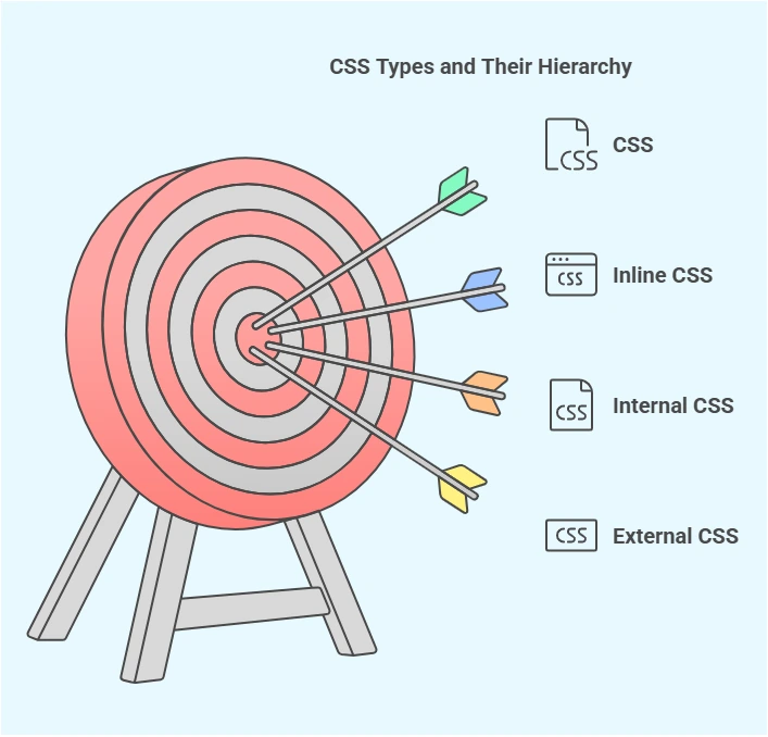
CSS can be applied to HTML documents in three ways:
- Inline CSS: Styles are applied directly within an HTML element using the style attribute.
<p style="color: blue;">This is a blue paragraph.</p>
- Internal CSS: Styles are defined within a <style> tag in the <head> section of the HTML document.
<head>
<style>
p {
color: blue;
}
</style>
</head>- External CSS: Styles are placed in a separate .css file, which is linked to the HTML document using the <link> tag.
<head>
<link rel="stylesheet" href="styles.css">
</head>
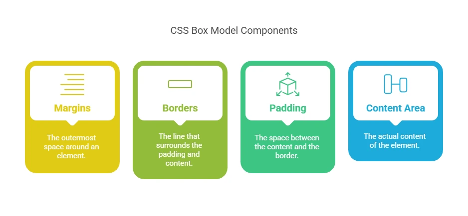
Ques 3: What is the CSS Box Model?
Ans.
The CSS Box Model is a fundamental concept that describes how elements are structured and displayed on a web page. It consists of:
- Content: The actual content of the element, such as text or images.
- Padding: The space between the content and the border.
- Border: A line surrounding the padding (if any) and content.
- Margin: The space outside the border, separating the element from other elements.
Understanding the Box Model is crucial for accurately controlling the layout and spacing of elements on a web page.
Ques 4: What is the difference between relative, absolute, fixed, and sticky positioning in CSS?
Ans.
- Relative: Positions an element relative to its normal position in the document flow.
- Using position: relative; allows you to adjust the element’s position without affecting the layout of surrounding elements.
- Absolute: Removes the element from the normal document flow and positions it relative to its nearest positioned ancestor (an ancestor with a position other than static).
- If no such ancestor exists, it positions relative to the initial containing block (usually the <html> element).
- Fixed: Removes the element from the document flow and positions it relative to the viewport.
- The element remains in the same position even when the page is scrolled.
- Sticky: A hybrid of relative and fixed positioning.
- The element is treated as relative until it reaches a specified scroll position, after which it becomes fixed within its containing block.
Understanding these positioning methods is essential for creating dynamic and responsive layouts.
Ques 5: What is Flexbox and why is it useful?
Ans.
Flexbox, or the Flexible Box Layout, is a CSS layout module designed to provide a more efficient way to arrange and align items within a container. It is particularly useful for creating responsive layouts and offers the following advantages:
- Simplified Alignment: Easily centers items horizontally and vertically.
- Responsive Design: Allows items to adjust their size and order to fit different screen sizes.
- Space Distribution: Distributes space between items evenly or according to specified rules.
- Order Control: Changes the visual order of items without altering the HTML structure.
Flexbox is ideal for designing complex layouts with minimal code and is widely supported across modern browsers.
Ques 6: What are CSS selectors? Can you list some common types?
Ans.
CSS selectors are patterns used to select and style HTML elements.
Common types include-
- Type Selector: Selects elements by their tag name.
p {
   color: blue;
}- Class Selector: Selects elements with a specific class attribute.
.example {
                   font-size: 16px;
}- ID Selector: Selects an element with a specific id attribute.
#unique {

background-color: yellow;
}- Universal Selector: Selects all elements.
* {
margin: 0;
padding: 0;
}- Attribute Selector: Selects elements based on an attribute and its value.
input[type="text"] {
border: 1px solid #ccc;
}- Pseudo-Class Selector: Selects elements based on their state.
a:hover {
color: red;
} Ques 7: What are the different kinds of Doctypes available?
Ans.
In CSS, the display property determines how an element is displayed on a webpage. Here’s how block, inline, and inline-block elements differ:
Block Elements:
- These elements take up the full width available, starting on a new line.
- Examples: <div>, <p>, <section>.
- Can have width, height, margins, and padding.
Inline Elements:
- Only occupy as much space as necessary to fit their content and do not start a new line.
- Examples: <a>, <span>, <strong>.
- Cannot have width or height applied (unless changed with inline-block).
Inline-Block Elements:
- These combine features of both block and inline elements.
- They do not start a new line, but can have width, height, and padding/margins.
- Examples: <img>, <button>, custom elements with display: inline-block.
In summary, block elements are full-width and start on new lines, inline elements flow inline without breaking lines, and inline-block elements allow control over size and layout while flowing inline.
Ques 8: What is the difference between em, rem and px in CSS?
- px (Pixels): A fixed unit that does not change based on the parent or screen size. Example:
p {
font-size: 16px;
}
- em: A relative unit that is based on the font size of the parent element.
div {
font-size: 20px;
}
p {
font-size: 1.5em; /* 1.5 times the parent’s font size (20px * 1.5 = 30px) */
}
- rem (Root em): Similar to em, but relative to the root (html) element’s font size.
html {
font-size: 16px;
}
p {
font-size: 2rem; /* Always 32px (16px * 2) */
}
Ques 9: What is Grid Layout in CSS?
Ans.
The CSS Grid Layout provides a two-dimensional way to arrange elements in rows and columns. It offers precise control over the placement of items.
Example of Grid Layout:
css-
.container {
display: grid;
grid-template-columns: 1fr 2fr 1fr; /* Three columns */
grid-template-rows: auto;
gap: 10px;
}
html-
<div class="container">
<div>Item 1</div>
<div>Item 2</div>
<div>Item 3</div>
</div>
- Note – The Grid Layout is ideal for complex layouts like dashboards and responsive designs.
Ques 10: What are pseudo-classes and pseudo-elements in CSS?
Ans.
- Pseudo-classes: Used to style elements based on their state (e.g., :hover, :focus, :nth-child()).
a:hover {
color: red;
}- Pseudo-elements: Used to style specific parts of an element (e.g., ::before, ::after).
p::first-letter {
font-size: 24px;
font-weight: bold;
}
Prime Course Trailer
Related Banners
Get PrepInsta Prime & get Access to all 200+ courses offered by PrepInsta in One Subscription
CSS Interview Questions and Answer for Experienced
Ques 11: What is the difference between nth-child() and nth-of-type()?
Ans.
- nth-child(n): Selects the nth child element, regardless of type.
- nth-of-type(n): Selects the nth child of a specific type.
p:nth-child(2) {
color: blue; /* Styles the second child, even if it's not a `<p>` */
}
p:nth-of-type(2) {
color: red; /* Styles only the second `<p>` element */
} Ques 12: What is media query in CSS?
Ans.
Media queries help create responsive designs by applying styles based on screen width, device type, or resolution.
@media (max-width: 600px) {
body {
background-color: lightgray;
}
}
This changes the background color if the screen width is 600px or smaller.
Ques 13: What is the difference between visibility: hidden; and display: none;?
Ans.
- visibility: hidden; Hides the element but keeps its space in the layout.
- display: none; Removes the element from the layout completely.
.hidden {
visibility: hidden;
}
.none {
display: none;
}
Ques 14: How to create a responsive navigation menu using CSS?
Ans.
Using flexbox and media queries:
css-
.nav {
display: flex;
justify-content: space-between;
}
@media (max-width: 600px) {
.nav {
flex-direction: column;
}
}
html –
<div class="nav">
<a href="#">Home</a>
<a href="#">About</a>
<a href="#">Contact</a>
</div>
- Note – This makes the menu stack vertically on smaller screens.
Ques 15: What is the difference between max-width and min-width?
Ans.
max-width: Defines the maximum width an element can take. min-width: Defines the minimum width an element should have.
div {
max-width: 500px;
min-width: 200px;
}
The div will not shrink below 200px or grow beyond 500px.
Ques 16: What is a z-index in CSS?
Ans.
The z-index property controls the stacking order of elements. Higher values appear on top.
Example :
.box1 {
position: absolute;
z-index: 1;
}
.box2 {
position: absolute;
z-index: 2;
}
Output Result in summary – .box2 will be on top of .box1 because it has a higher z-index.
Ques 17: What is the difference between opacity and rgba in CSS?
Ans.
- opacity: Changes transparency of the entire element (including text and child elements).
- rgba: Only affects the background color’s transparency.
div {
background-color: rgba(255, 0, 0, 0.5); /* Red with 50% transparency */
}
Ques 18: What is object-fit and object-position in CSS?
Ans.
- object-fit: Defines how an image fits inside its container.
img {
object-fit: cover;
}- object-position: Defines the position of the image inside its container.
img {
object-position: center;
}
Ques 19: What is the difference between absolute and fixed positioning?
Ans.
- absolute: Positioned relative to the nearest positioned ancestor.
- fixed: Positioned relative to the viewport and does not move when scrolling.
Example :
.absolute-box {
position: absolute;
top: 50px;
left: 50px;
}

.fixed-box {
position: fixed;
top: 0;
left: 0;
} Ques 20: How to create a CSS animation?
Ans.
Using @keyframes:
@keyframes example {
from {
background-color: red;
}
to {
background-color: blue;
}
}
div {
animation: example 2s infinite;
}
Results in Summary – This animates the background color of a div from red to blue in 2 seconds.
Conclusion
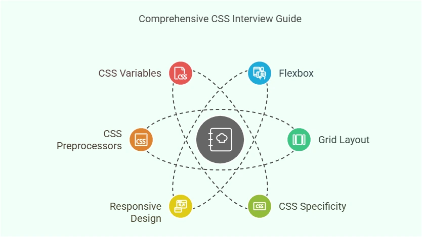
Preparing for a CSS interview requires a strong understanding of fundamental concepts, practical application, and problem-solving skills. In this guide, we covered essential CSS interview questions and answers, ranging from basic syntax to advanced topics like Flexbox, Grid, animations, and responsive design.
Also Check –
- HTML Interview Questions
- JavaScript Interview Questions
- C++ Technical Interview Questions
- OS Technical Interview Questions
- C Technical Interview Questions
- JAVA Technical Interview Questions
- Python Technical Interview Questions
- DSA Technical Interview Questions
- DBMS Technical Interview Questions
- Software Engineering Question
- DSA Technical Interview Questions For Freshers
- Github Technical Interview Questions
- SQL Technical Interview Questions
- Most Asked Coding Question
Get over 200+ course One Subscription
Courses like AI/ML, Cloud Computing, Ethical Hacking, C, C++, Java, Python, DSA (All Languages), Competitive Coding (All Languages), TCS, Infosys, Wipro, Amazon, DBMS, SQL and others