
Data Analytics Using Excel
Data Analytics Using Excel
- Data Analytics Using Excel has been a cornerstone tool for data analysis for decades, making it an essential skill for professionals across industries.
- With its powerful features, user-friendly interface, and advanced functionalities, Excel allows users to perform data analytics tasks efficiently.
- In this article, we’ll explore how Excel can be used for data analytics, its key features, and practical tips for analyzing data effectively.
What is Data Analytics?
Data analysis is the process of inspecting, cleaning, transforming, and modeling data to uncover useful information, inform conclusions, and support decision-making. It involves using various tools and techniques to make sense of raw data, identify patterns, and extract insights that can drive business and operational success.

Getting Started with Data Analytics in Excel
Excel offers a wide range of features to help users begin their data analytics journey.
Steps to Get Started:
- Import data into Excel using built-in import tools.
- Understand the basic functions like sorting, filtering, and basic formulas.
- Familiarize yourself with Excel’s interface and navigation tools.
Pointers:
- Use Excel templates for faster analysis.
- Save your workbooks in accessible formats like .xlsx or .csv.
- Practice frequently to enhance proficiency.
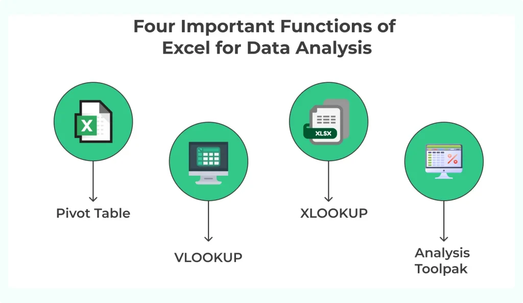
Key Features of Excel for Data Analytics
Pivot Tables:: Summarize and analyze large datasets quickly.
Conditional Formatting: : Highlight trends or anomalies in your data.
Charts and Graphs: : Create visual representations of data for better insights.
Data Validation:: Ensure the accuracy and consistency of input data.

Methods of Data Analysis
There are several methods used in data analysis, depending on the goals and type of data:
- Descriptive Analysis: Summarizes past data to understand what has happened.
- Diagnostic Analysis: Explores the reasons behind past outcomes.
- Predictive Analysis: Uses historical data to forecast future trends.
- Prescriptive Analysis: Suggests actions to optimize outcomes.
How to Prepare for Data Analytics Jobs?
Learn Technical Skills: Master Python, SQL, and data visualization tools.
Build Projects: Create a portfolio showcasing projects like sales forecasting, sentiment analysis, or customer segmentation.
Certifications: Enroll in courses on Like PrepInsta Prime and Prime Max Academy.
Mock Interviews: Practice solving case studies and behavioral interview questions .
Data Cleaning and Preparation in Excel
Before analysis, raw data needs to be cleaned and prepared.
Steps for Data Cleaning:
- Remove duplicates to maintain data integrity.
- Handle missing values using formulas like
IForAVERAGE. - Use
Text to Columnsfor splitting combined data fields.
Pointers:
- Utilize filters to spot outliers.
- Use formulas like
TRIMto clean extra spaces. - Leverage the
Find and Replacetool for consistency in data.
Visualizing Data with Excel
Data visualization is an integral part of data analytics, and Excel excels in this area.
Visualization Options:
- Line Charts: Ideal for tracking changes over time.
- Bar and Column Charts: Great for comparing values.
- Pie Charts: Represent proportions in your data.
- Scatter Plots: Analyze relationships between two variables.
Pointers:
- Use color-coding to make charts more intuitive.
- Add slicers and timelines for interactive dashboards.
- Label axes and data points clearly for better understanding.
How to Prepare for Data Analytics Jobs?
Learn Technical Skills: Master Python, SQL, and data visualization tools.
Build Projects: Create a portfolio showcasing projects like sales forecasting, sentiment analysis, or customer segmentation.
Certifications: Enroll in courses on Like PrepInsta Prime and Prime Max Academy.
Mock Interviews: Practice solving case studies and behavioral interview questions .
Conclusion
- Excel remains one of the most versatile and accessible tools for data analytics, offering a wide range of features and functionalities.
- From data cleaning and analysis to visualization and automation, Excel equips users with the tools needed to gain insights and make data-driven decisions. Whether you are a beginner or an experienced professional, mastering Excel can significantly enhance your data analytics skills.