
Basic Bivariate analysis
Explore the Basic Bivariate Analysis
Basic Bivariate Analysis focuses on understanding the relationship between two variables to identify patterns, trends, and connections in data. It is a fundamental step in data analysis that helps researchers and analysts make informed decisions. By examining how one variable affects another, it provides valuable insights for prediction and interpretation.
Bivariate analysis uses methods like correlation and scatter plots to measure and visualize relationships between variables.
It helps determine whether variables move together, in opposite directions, or show no relationship, making it essential for accurate data interpretation.

Introduction to Bivariate Analysis
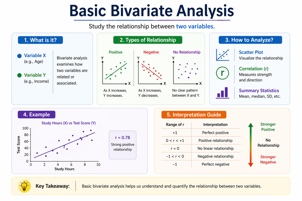
Bivariate analysis is the statistical examination of the relationship between exactly two variables.
- It aims to understand whether a connection exists between the variables and, if so, the nature and strength of that relationship.
- This type of analysis is fundamental in data analysis, as it lays the groundwork for more complex multivariate methods.
- It is widely used in fields such as social sciences, healthcare, marketing, education, and economics to draw meaningful conclusions from data.
- For example, a researcher might investigate whether there is a relationship between the number of hours a student studies and their exam scores.
- By using bivariate analysis, they can determine if increased study time is associated with higher scores, suggesting a positive correlation.
There are several techniques used in bivariate analysis depending on the data types involved. These include:
- Scatter plots for visualizing relationships between two quantitative variables.
- Correlation coefficients (like Pearson’s r) to measure the strength and direction of a linear relationship.
- Cross tabulation and chi square tests for categorical variables.
- T-tests and ANOVA when comparing means across groups.
Overall, bivariate analysis helps researchers and analysts make data driven decisions by identifying significant patterns, trends, and associations that merit further exploration.
- Always check for missing data before running your analysis.
- Standardize variables if they are on very different scales.
- Use transformation (like log or square root) to handle skewed data.
- Compare results with multiple statistical methods for validation.
- Maintain a data dictionary to track variable definitions and formats.


Types of Variables
Understanding the types of variables involved in a study is a crucial first step before applying any statistical analysis. The nature of the variables determines which analytical methods are appropriate, how the data can be visualized, and what kind of relationships can be interpreted.
Variables are generally classified into two main categories: quantitative variables and categorical variables. Each type serves a different purpose and requires different analytical techniques.
1. Quantitative Variables
Quantitative variables are numerical in nature and represent measurable quantities. These variables can be either discrete (having specific, separate values, such as the number of children in a family) or continuous (taking any value within a given range, such as height or weight). Examples of quantitative variables include:
- Height and weight of individuals
- Age of a person
- Monthly income
- Test scores
- Temperature readings
Quantitative variables are commonly used when analyzing trends, calculating averages, or identifying correlations. They allow for a wide range of statistical techniques such as regression analysis, correlation, and measures of central tendency.
2. Categorical Variables
Categorical variables represent data that can be divided into groups or categories. These categories have no inherent numeric value, although they may sometimes be assigned codes for analysis. Categorical variables can be further classified as:
- Nominal variables: Categories with no specific order (e.g., gender, eye color, religion)
- Ordinal variables: Categories with a meaningful order but not evenly spaced (e.g., education level, satisfaction rating)
Examples of categorical variables include:
- Gender (male, female, other)
- Region (North, South, East, West)
- Education level (high school, undergraduate, postgraduate)
- Marital status (single, married, divorced)
Categorical data is typically analyzed using frequency counts, cross tabulations, bar charts, and statistical tests like the chi square test for independence.
Methods of Bivariate Analysis
Bivariate analysis involves the examination of the relationship between two variables, and the method chosen largely depends on the type of variables being studied whether they are quantitative, categorical, or a mix of both. The goal is to understand whether an association exists between the variables and to what extent that relationship can be described, quantified, or predicted. Below are some of the most commonly used methods in bivariate analysis, along with their typical use cases and advantages.
1. Correlation Analysis
Correlation analysis is used when both variables are quantitative (numerical). It helps determine the strength and direction of the linear relationship between the two variables. The most commonly used correlation coefficient is Pearson’s correlation coefficient (r), which ranges from -1 to +1:
- +1 indicates a perfect positive correlation (as one variable increases, the other also increases).
- -1 indicates a perfect negative correlation (as one variable increases, the other decreases).
- 0 suggests no linear correlation between the variables.
For example, correlation analysis might be used to examine the relationship between students’ study hours and their exam scores. A strong positive correlation would suggest that more study hours are generally associated with higher scores.
2. T-tests and ANOVA
When comparing the means of a quantitative variable across different groups of a categorical variable, t-tests and Analysis of Variance (ANOVA) are the go to techniques.
- A t-test is typically used when comparing two groups (e.g., average test scores of male vs. female students).
- ANOVA is used when comparing more than two groups (e.g., average salaries across different education levels).
These tests help determine whether the differences in group means are statistically significant or likely due to random variation. They are widely used in experimental research, medical studies, and social sciences to evaluate the impact of different categories on a measurable outcome.
3. Chi-Square Test
The Chi-Square Test of Independence is used when both variables are categorical. It assesses whether there is a significant association between the categories of the two variables.
For example, a chi square test might be used to analyze whether gender is associated with a particular brand preference. The results show whether the observed distribution differs from what would be expected if there were no relationship.
This test is non parametric, meaning it does not rely on assumptions about the distribution of data, making it highly versatile for survey data and frequency based studies.
4. Simple Linear Regression
Simple linear regression is used when one variable is considered dependent (outcome) and the other is independent (predictor), both of which are quantitative. It models the relationship between the two variables using a straight line:
Y=a+bX+ϵ
Where:
- Y is the dependent variable,
- X is the independent variable,
- a is the intercept,
- b is the slope (representing the change in Y for each unit change in X),
- ε is the error term.
For example, you could use linear regression to predict a person’s income based on their years of experience. It not only helps in understanding the relationship but also enables predictions.
- When exploring the relationship between two variables before modeling.
- When testing a simple hypothesis like “X influences Y.”
- When preparing to choose features for regression or classification.
- When identifying trends or associations in survey results.
- When comparing responses across different demographic groups.
Visualization Techniques in Bivariate Analysis
Visualization plays a crucial role in understanding and interpreting data, especially when working with two variables. In Basic Bivariate analysis, visual tools make it easier to detect patterns, trends, and relationships that may not be immediately obvious through numerical summaries alone. By turning raw data into intuitive graphical formats, analysts and researchers can gain insights quickly and communicate findings more effectively to others.
Depending on the types of variables involved quantitative, categorical, or a mix of both different visualization techniques are applied. Below are some of the most commonly used visual tools in bivariate analysis:
1. Scatter Plots
Scatter plots are one of the most popular and effective visualization tools when working with two quantitative variables. Each point on the plot represents an observation, positioned according to its values for the two variables. Scatter plots help in identifying:
- Positive or negative trends
- Strength of the relationship
- Clusters or outliers
- Linear or non linear patterns
For example, a scatter plot showing hours studied vs. exam scores can reveal whether increased study time is associated with higher scores and whether that relationship is linear.
2. Box Plots
Box plots, also known as box and whisker plots, are useful for comparing the distribution of a quantitative variable across the categories of a categorical variable. They show median, quartiles, and potential outliers, giving a clear picture of how data is spread within each group.
For instance, a box plot comparing student test scores across different school types (public, private, charter) can quickly reveal differences in central tendencies and variability across these categories.
3. Bar Charts
Bar charts are commonly used when both variables are categorical, or when comparing the frequency of a categorical variable across groups. They are especially helpful in illustrating proportions or distributions within datasets.
A bar chart might be used to compare the number of students enrolled in different academic programs by gender. Each bar represents a category, and the height shows the frequency or percentage.
4. Heatmaps and Contingency Tables
Heatmaps are graphical representations of data where values are represented by color gradients. They are often used in combination with contingency tables, which display the frequency distribution of variables in a matrix format. These tools are excellent for examining the relationship between two categorical variables.
For example, a heatmap showing customer preferences across age groups and product types can reveal which combinations are most popular and whether any clear patterns emerge.
Why Visualization Matters in Basic Bivariate Analysis
Using visualization in Basic Bivariate analysis enhances both exploratory and explanatory data analysis. It enables users to:
- Detect trends and correlations visually
- Spot anomalies or outliers
- Identify potential areas for deeper statistical testing
- Communicate findings clearly to both technical and non technical audiences
In summary, selecting the right visual representation based on the variable types is key to gaining insights and supporting sound decision making. Whether using scatter plots for numerical data or heatmaps for categorical relationships, effective visualization brings data stories to life.
Conclusion
Basic Bivariate analysis is an essential step in any data analysis process. It helps uncover meaningful relationships, guides hypothesis generation, and informs more complex modeling. By understanding variable types, choosing appropriate methods, visualizing data effectively, and avoiding common pitfalls, anyone can leverage the power of bivariate analysis to extract valuable insights from data.
Frequently Asked Questions
Answer:
Basic bivariate analysis is a statistical method used to study the relationship between two variables. It helps in understanding how one variable affects or relates to another. This type of analysis is commonly used in data exploration. It provides insights into patterns and associations in data.
Answer:
It helps identify relationships, trends, and correlations between variables. This makes it easier to draw meaningful conclusions from data. It is also useful in testing hypotheses and validating assumptions. Analysts use it to support better decision-making.
Answer:
Common methods include scatter plots, correlation analysis, and simple regression. These techniques help visualize and measure relationships between variables. Each method serves a different purpose depending on the data type. Together, they provide a clear understanding of data behavior.
Answer:
Univariate analysis focuses on a single variable, while bivariate analysis involves two variables. Bivariate analysis looks at relationships, whereas univariate analysis looks at distribution. This makes bivariate analysis more useful for finding connections. Both are important steps in data analysis.
Answer:
Correlation measures the strength and direction of the relationship between two variables. It shows whether variables move together or in opposite directions. The value ranges from negative to positive. This helps in understanding the degree of association.
Answer:
Regression is used to predict the value of one variable based on another. It establishes a mathematical relationship between dependent and independent variables. This method is useful for forecasting and trend analysis. It is widely used in business and research.
Answer:
Bivariate analysis is used in marketing, finance, healthcare, and research. For example, it can analyze the relationship between sales and advertising spend. It is also used to study customer behavior and trends. This helps organizations make data-driven decisions.
Answer:
A data analyst is responsible for collecting, processing, and interpreting data. The goal is to find useful insights that support decision-making. They work with tools and techniques to analyze trends and patterns. This role is important in many industries.
Answer:
Key skills include data analysis, problem-solving, and critical thinking. Knowledge of tools, data visualization, and basic statistics is also important. Practical experience with datasets helps improve understanding. These skills are essential for handling real-world data tasks.
Answer:
Yes, it is a good career option for beginners interested in data and problem-solving. Many learning paths start with basic concepts and gradually build advanced skills. With consistent practice and projects, beginners can gain confidence. It offers strong career growth opportunities.